Your Cart is Empty

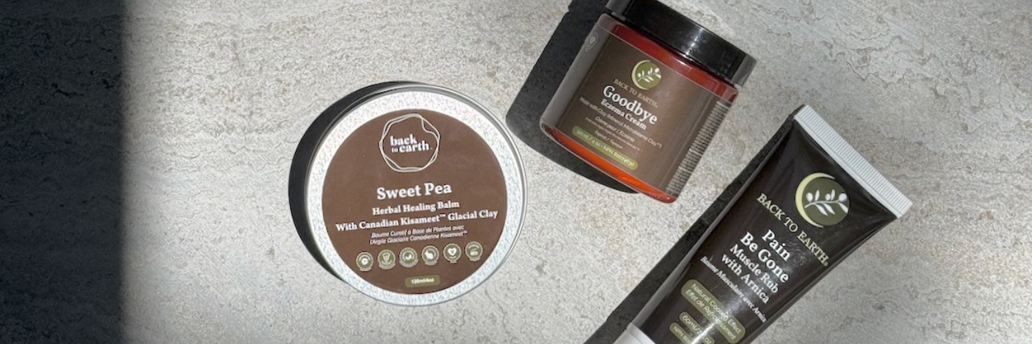
The introduction of our new brand marks an exciting evolution in Back to Earth's history - a history rooted in fostering natural living, being kind to our bodies and doing our part to protect earth's delicate ecosystem. Our fresh new logo was carefully thought out and crafted, like all the products we make and share. The design incorporates many natural elements including imagery of the Earth, the Sun, and the Moon.
The Moon is a feminine symbol, universally representing the rhythm of time as it embodies the cycle and is closely connected with the state of health. The phases of the moon symbolize new beginnings, enlightenment, and coming full circle. The crescent symbol reflects youth and vitality. The word crescent comes from the Latin term crescere meaning to grow, and is akin to the latin term ceres to bring forth, create.
The stylized olive branch at the center of the new logo is a timeless symbol of peace and purity. The olive branch has become the symbol of good will, and is presented as a peace offering from one to another, as in the phrase "extend an olive branch". This action speaks to Back to Earth's belief that bringing harmony and balance, feels good and encourages healing.
In essence, our new brand mark symbolizes that all nature: humans, animals, and the vegetation that surrounds us, are both interdependent and interconnected. We believe this new look exemplifies our mission to promote living naturally and we hope to inspire others to join in our movement to find ways to get back to earth.
~ Kiley
Comments will be approved before showing up.


